Soil Origin | Brand Origin Story
Soil Origin is an organic, natural, and sustainable brand committed to enhancing the well-being of its consumers while supporting the livelihoods of farmers. The brand spans two core categories: consumables (like snacks and pantry staples) and sustainable household and personal care products, all rooted in conscious living and environmental responsibility.
CLIENT
Ayush Gour
DELIVERABLES
Brand Identity Design, Illustration, Packaging Design, Ecommerce

The Challenge
The organic FMCG space in India is competitive, with hundreds of brands already occupying the "natural and sustainable" narrative. Our task wasn’t just to make Soil Origin look credible, it was to help it feel thoughtful, distinct, and grounded in something deeper than just green packaging.
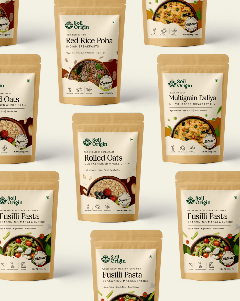
One of the biggest hurdles was the brand’s wide product assortment. With everything from reusable household items to snacks and self-care products, the lack of product architecture was a risk for both consumer confusion and visual inconsistency.
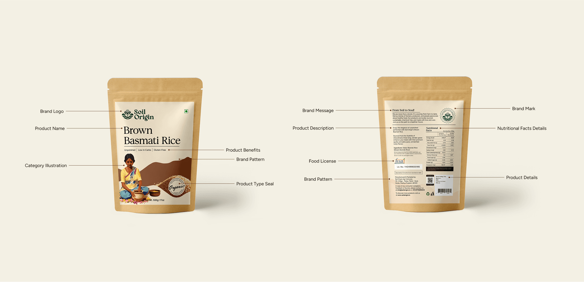
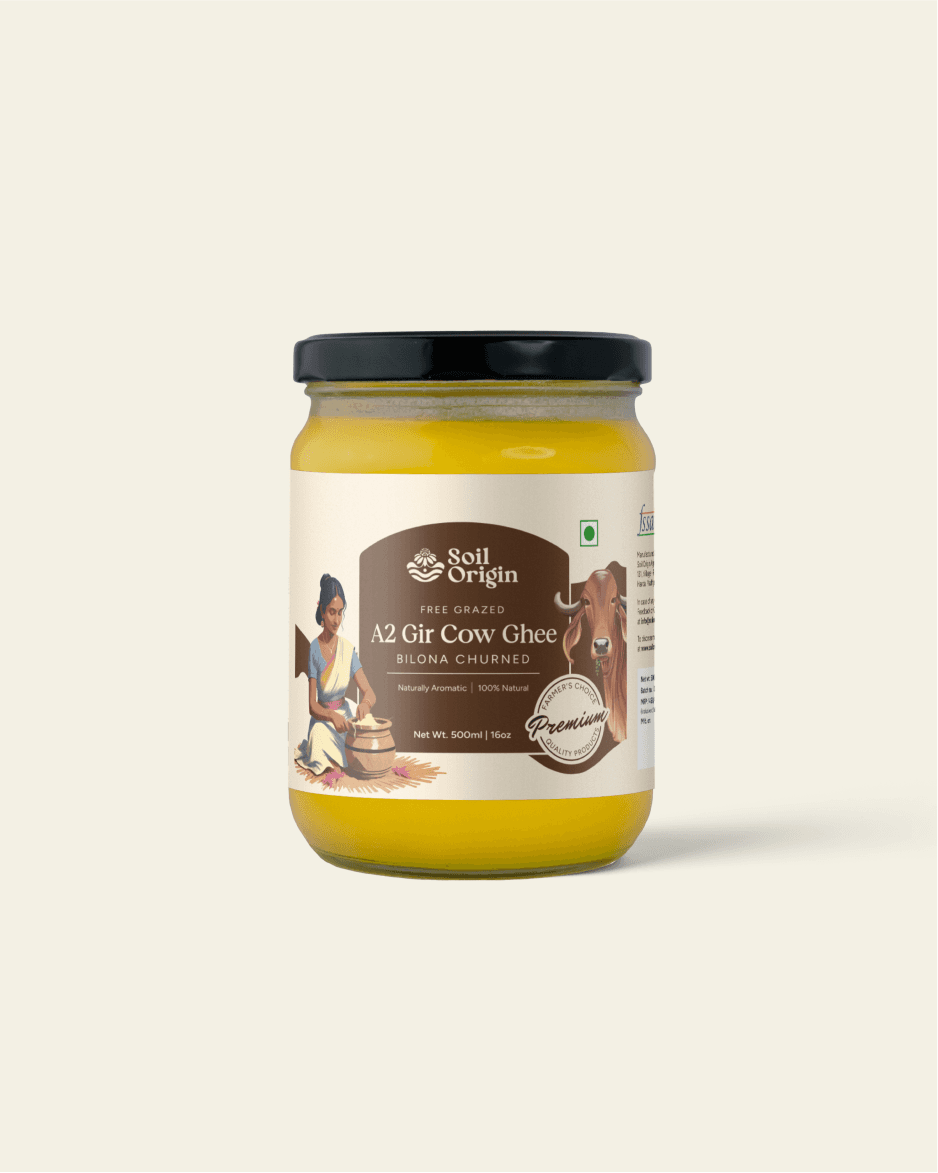
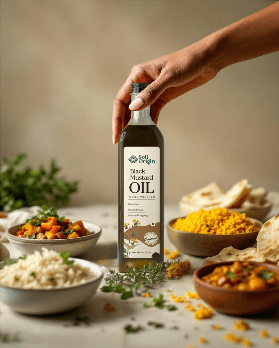
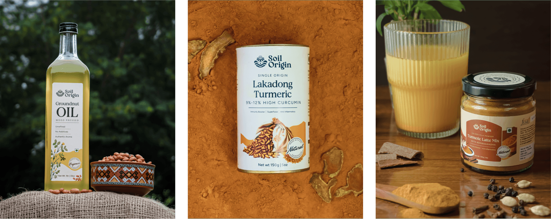
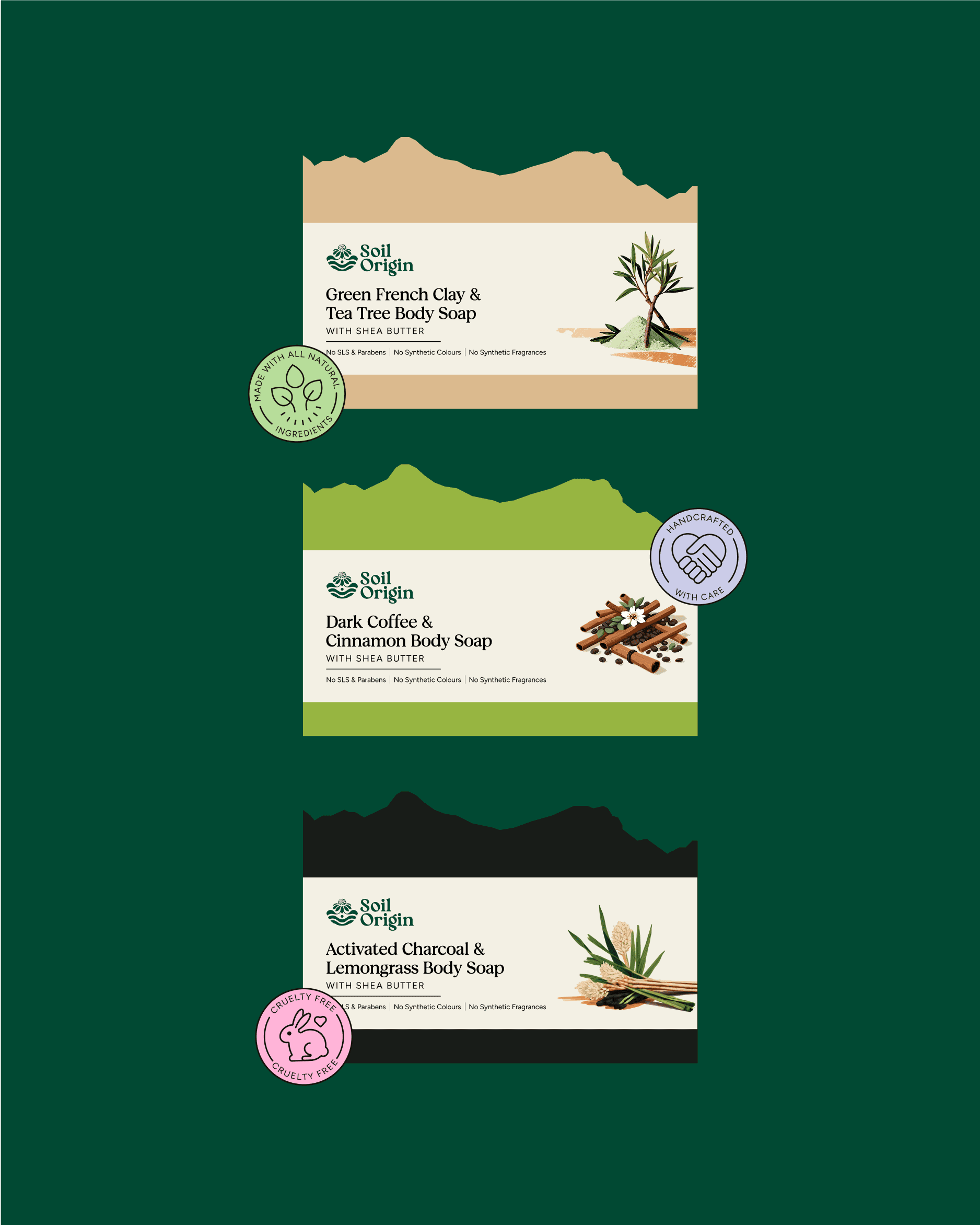
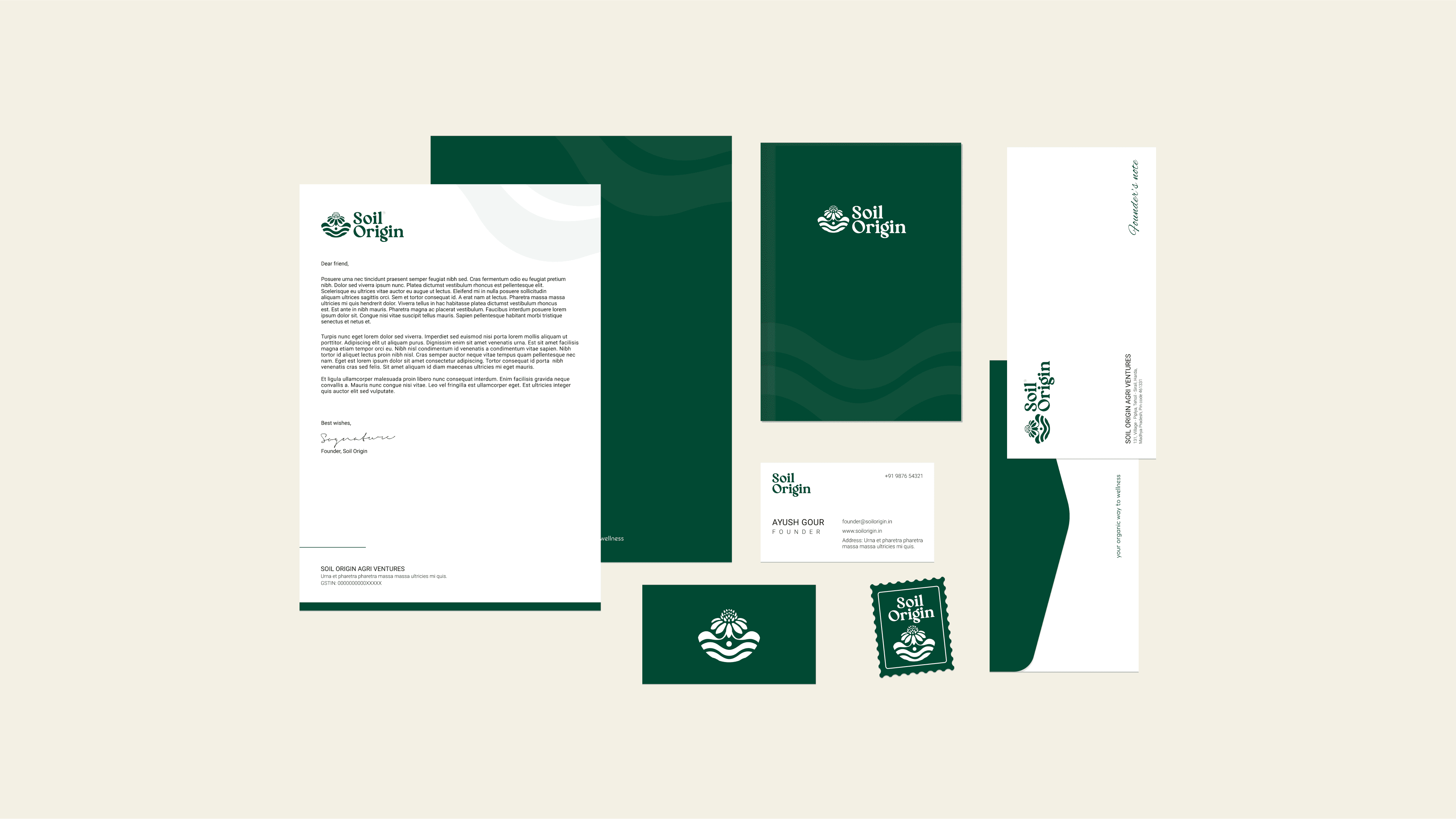
On top of that, each product came in a different material: glass jars, paper tubes, kraft pouches, dropper bottles. We needed a system flexible enough to hold together as a brand, regardless of what it was printed on.
Our Approach
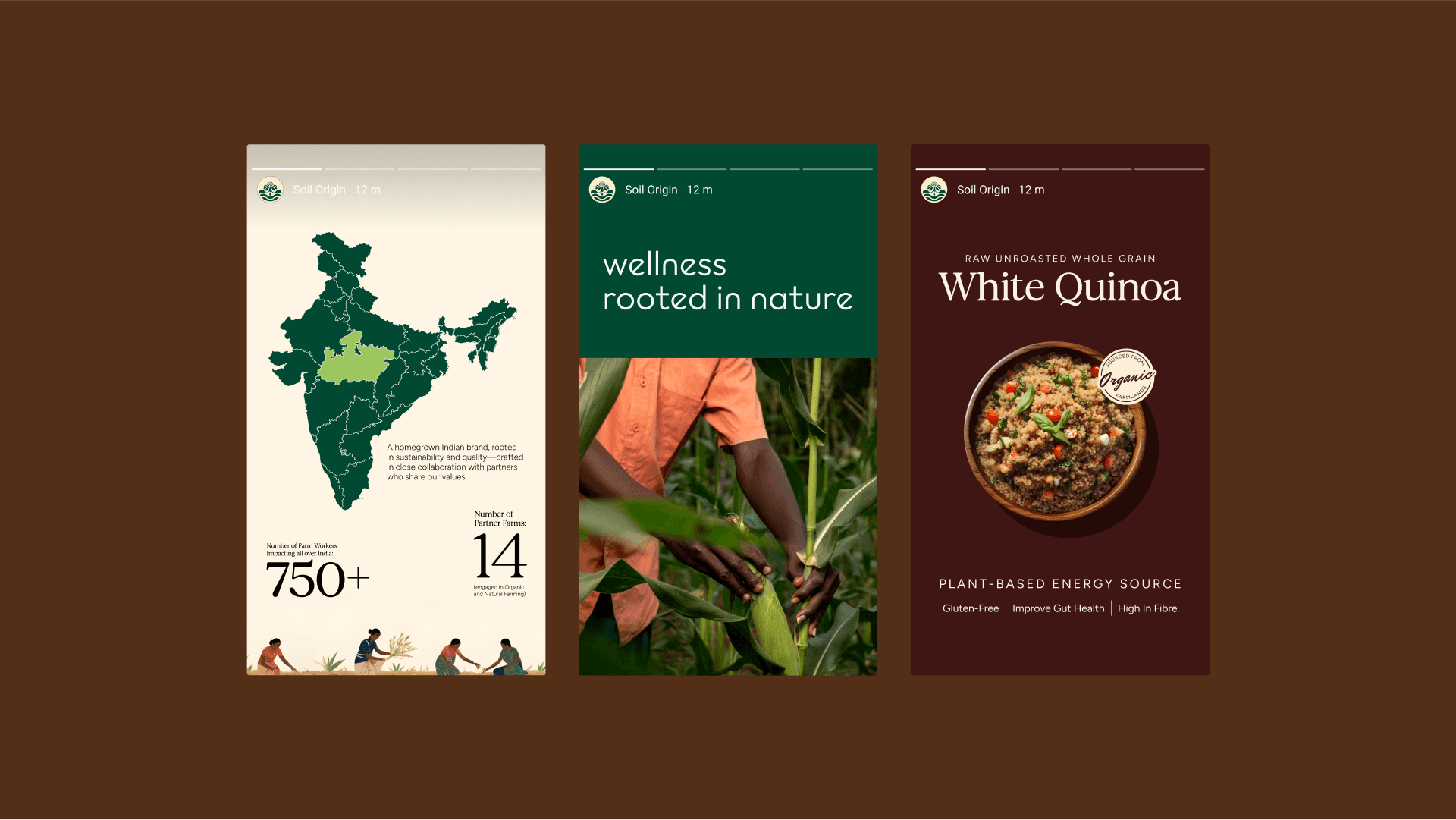
We started with strategy, mapping the brand’s values and translating them into a clear product hierarchy. The range was first split into three core verticals for clarity: Household Goods, Snacking and Personal & Home Care.
From there, we defined seven sub-categories for product type differentiation. This allowed us to create a design system with visual flexibility, while keeping consistency across formats and materials.
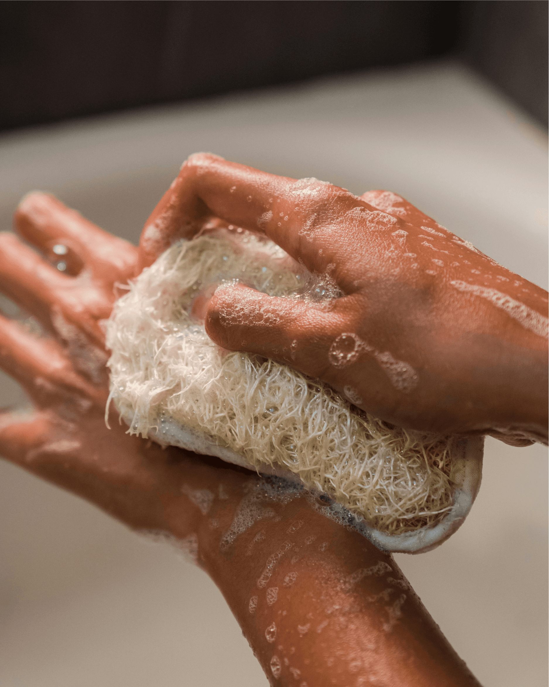
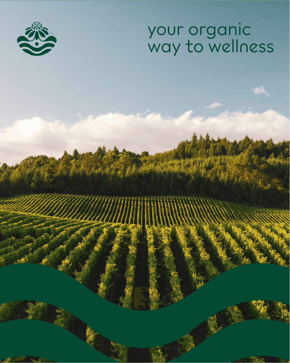
Visually, the brand needed to feel warm and empathetic, but not too soft. We leaned into earth-toned palettes and paired them with custom illustrations that reference farm life, not in a decorative way, but as a storytelling device to build trust and connection.
Tone-wise, we shaped the brand voice to feel caring, practical, and quietly confident, mirroring the values of families and individuals who want to make thoughtful choices without being overwhelmed.

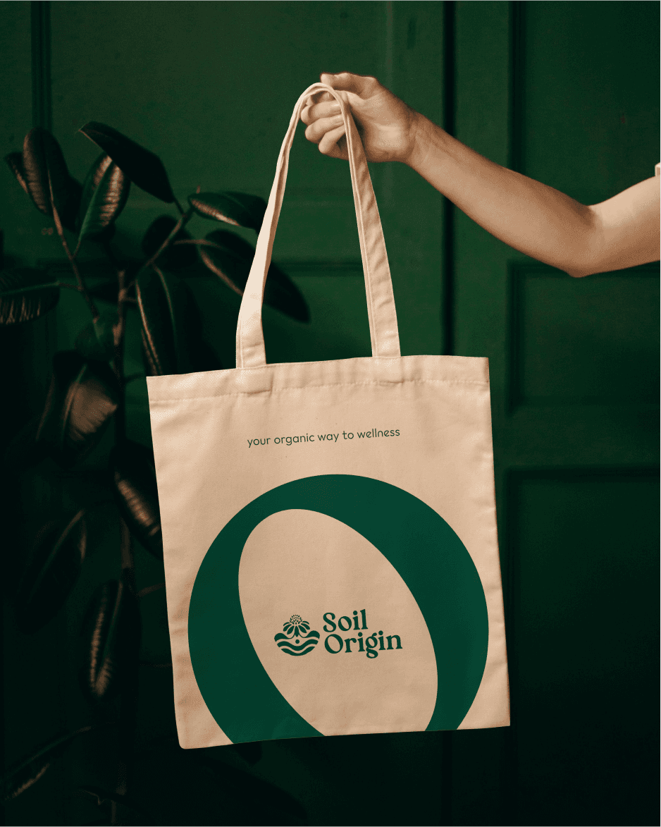
The result is a brand that feels rooted, consistent, and deeply considered, across categories, packaging materials, and use cases. The identity carries a minimalist strength, softened by intentional details: quiet textures, bespoke illustration, and structured layout systems that guide the user subtly, not loudly.
More than just a visual identity, the system gives Soil Origin room to grow. The architecture can hold future products without needing to rework the core, and that’s a design decision made with longevity in mind.