Voltron | Innovation Forging the Future
As a brand, Voltron is not just about transportation; it’s about revolutionizing the way we perceive and experience commuting. This is the journey of strategic branding transformation of Voltron.
CLIENT
Joseph Thomas, India
DELIVERABLES
Art Direction, Branding & Brand Identity
YEAR
2021
ROLE
Creative Head

Problem/Background Insight
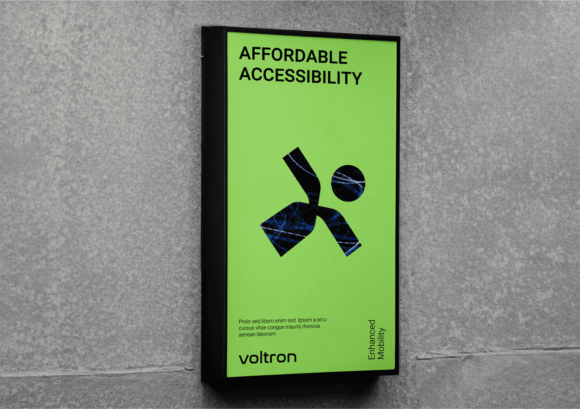
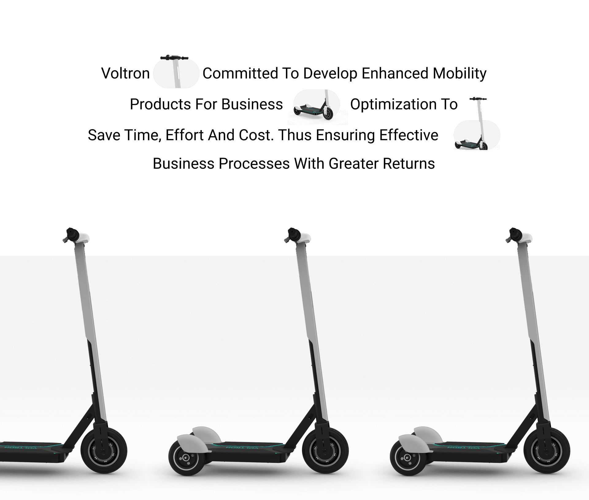
Voltron Electric Scooters, nestled in the heart of Bangalore, is a trailblazer in the realm of sustainable urban mobility. Recognizing a gap in the market for accessible short-distance travel solutions, Voltron seized the opportunity to make a difference. Powered by a team of dynamic individuals, Voltron is more than just a brand; it’s a revolution in the electric scooter industry. Their innovative solutions cater to those seeking convenient options for shorter commutes, carving a niche for Voltron in the market. With an unwavering commitment to sustainability, they resonate with environmentally conscious consumers, setting the stage for a greener future.
Let's find out how we successfully transformed Voltron's brand image to align with its values and capture the attention of environmentally conscious consumers.
Solution
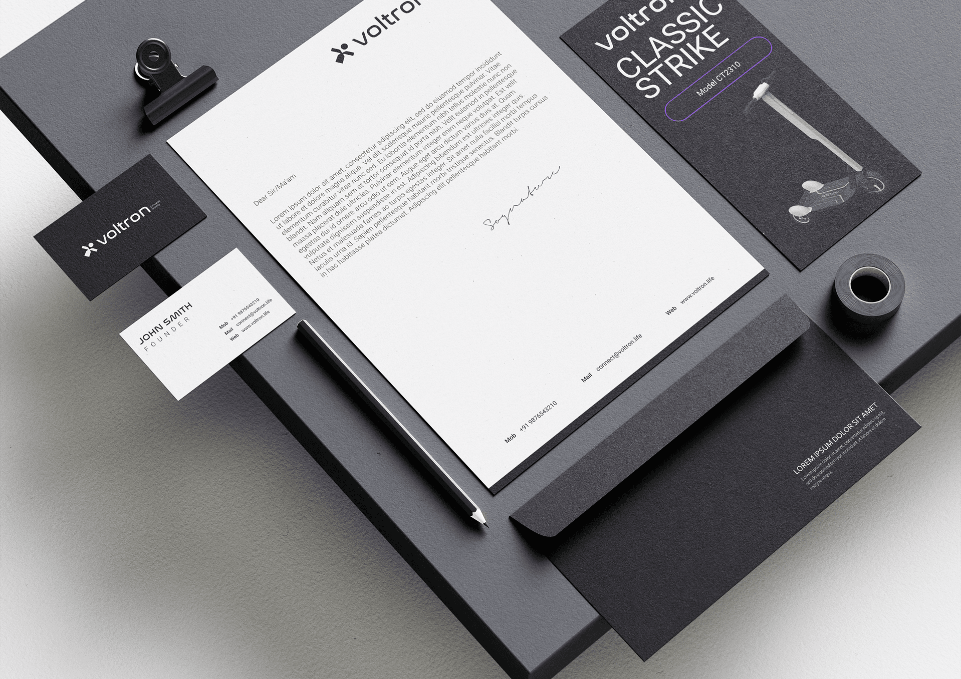
Grasping the transformative power of branding, Voltron aimed to infuse its core values of accessibility and sustainability into every aspect of its brand identity. They envisaged a brand where their logo and marketing materials would not only reflect their commitment to the environment but also their dedication to making short-distance travel more accessible. In this endeavor, we collaborated to create a visually compelling brand persona that aligns with their product line and serves as a symbol of their eco-conscious and user-friendly mission. This collaborative effort resulted in a brand that is visually distinctive, mirrors Voltron’s commitment to a sustainable future, and underscores its focus on accessibility.

Description
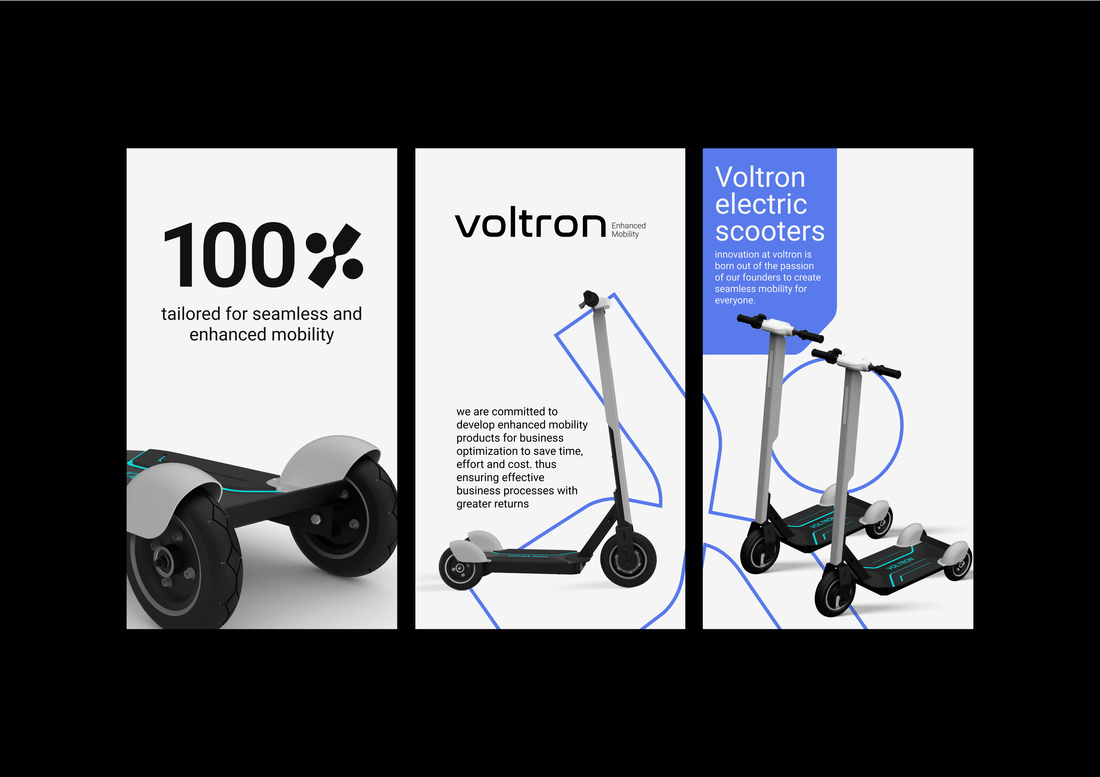
Voltron is deeply rooted in a profound commitment to innovation and sustainability. We lead the industry by offering eco-friendly, high-performance multi-utility electric scooters designed for urban mobility, businesses, and warehouses.
Voltron Electric Scooters, headquartered in Bangalore, stands as the vanguard of the electric scooter revolution, set to redefine commuting within expansive urban landscapes.
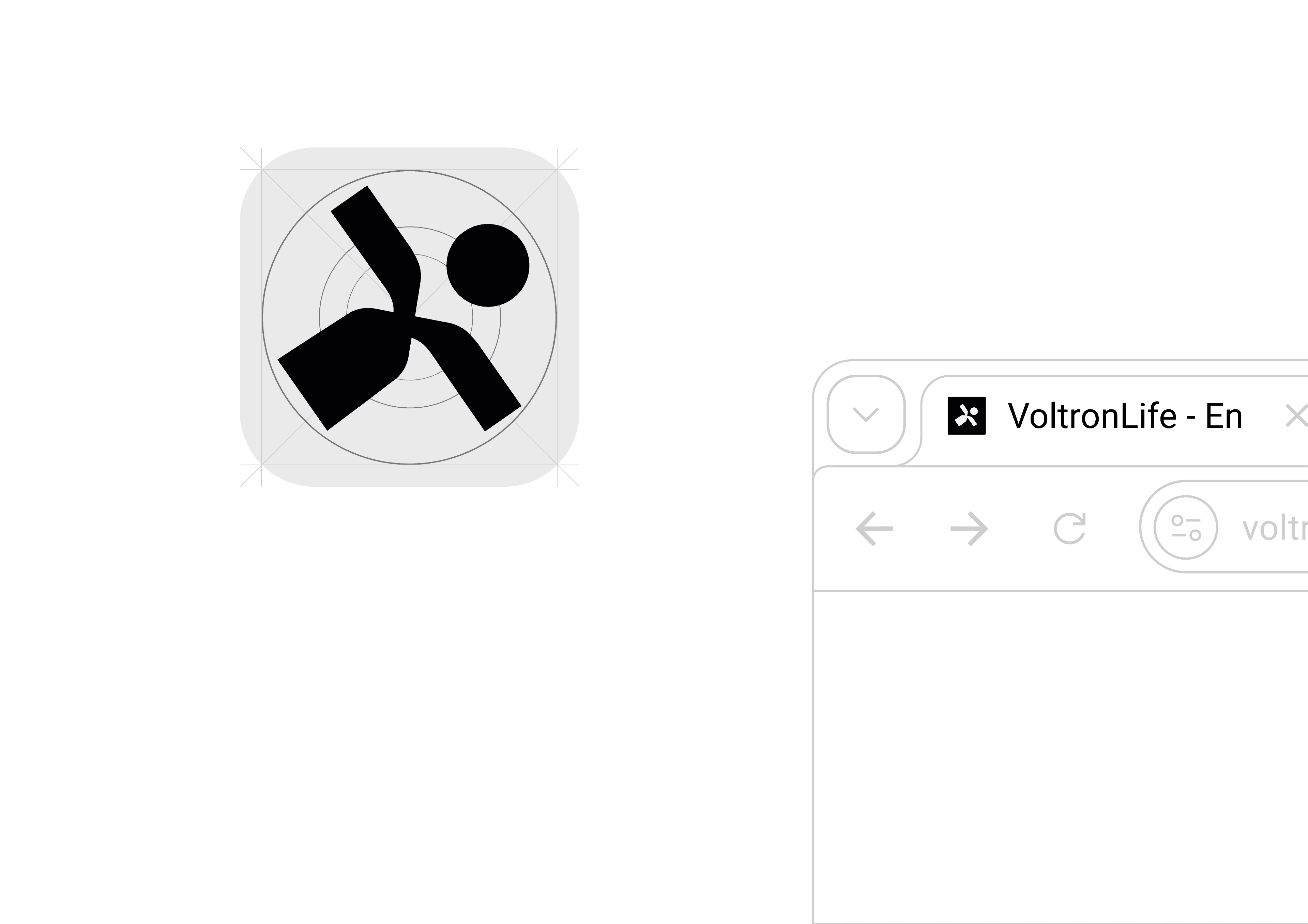
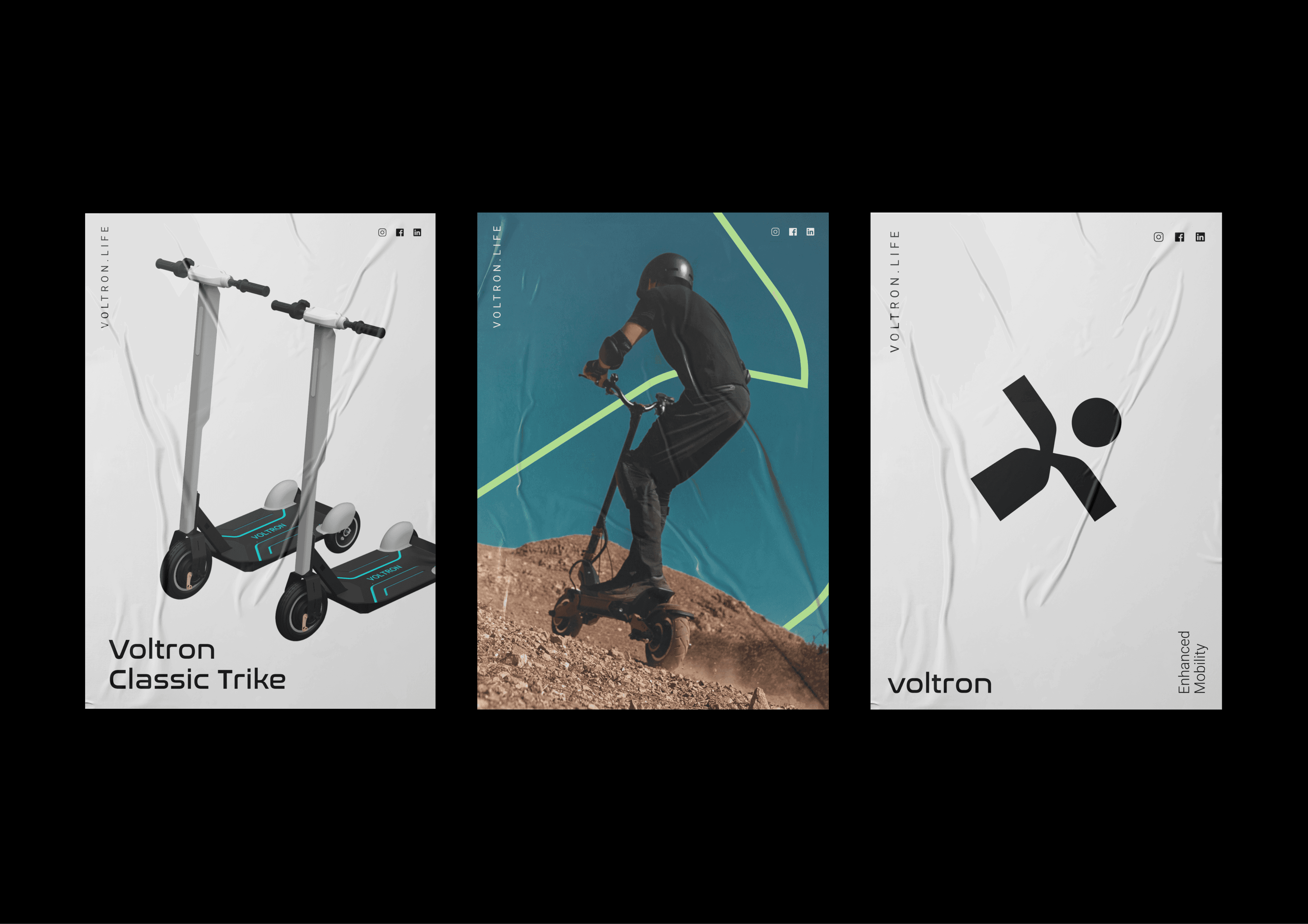
The deliberate avoidance of a lighter typographic style in the logo creation process wasn't merely incidental. It was a calculated move to stress the sense of robustness and strength, effectively emphasizing the product's endurance and resilience. By purposefully crafting a bold structure, the logo asserts its presence with independent visibility, ensuring it captures attention in alignment with the brand's forward-thinking approach and innovative journey. This deliberate choice echoes the brand's commitment to standing out and making a lasting impact.


The branding strategy was meticulously crafted for extensibility, ensuring its adaptability to future changes. Our strategic approach to branding was to position the brand for sustainable growth and enduring relevance.
The Monogram embodies a versatile and forward-looking essence while maintaining a partially minimalist appearance. It communicates an electronic and technology-driven brand essence, showcasing adaptability to explore diverse product categories. Crafted with a futuristic vision, the logo icon anticipates the potential launch of a user-friendly app. Its intentional bold structure ensures independent visibility and commands attention, aligning with the brand's innovative trajectory.